Conversation Design · ServiceNow · 2023–2026

Disambiguation
Design

Nine in ten requests to ServiceNow’s AI carried real ambiguity, and the system either guessed wrong or buried the answer under every option. I made clarification a design problem instead of an accident: a taxonomy of ambiguity types, and the standards for when the system asks versus acts. When the behavior was briefly removed, more than ten enterprise customers demanded it back by name.

90%of queries carry ambiguity (47% high, 43% medium)
10+enterprise customers escalated when it was removed
15internal teams asked to adopt the pattern

When the system can’t distinguish between what a user said and what they meant, things break quietly.

Conversational AI has a simple promise: it’s a back-and-forth interaction where clarification feels natural and conversational. Unlike filling out forms or clicking through options, you can ask for what you need in plain language, and the system can ask back to understand you better. This results in a one-of-a-kind effortless interaction where you get exactly what you want, not what the system thinks you want.

That is, if the system is designed well. ServiceNow’s system was not doing this. It was guessing wrong or overwhelming you with every possible answer. Users stopped trusting it. Disambiguation was the solution.

A well-designed disambiguation experience is nearly invisible. When it does ask, it feels like a knowledgeable colleague who has done most of the interpretive work and just needs one quick confirmation. One turn is the target. Two is the limit. Three or more signals a design problem.
My Role
Staff Designer, Conversation Design Lead
Strategy, Direction, Organizational Advocacy
Timeline
2023 – 2026
Collaborators
UX Research, Engineering, Product, Content Design
Status
Shipped · next version in active development
What is disambiguation

Disambiguation is the process of resolving ambiguity in what a user is asking before the system responds. It’s about recognizing when a query could reasonably mean multiple things, and choosing to ask one clarifying question instead of providing a response that covers every possibility. It’s a design decision about when to admit uncertainty and ask for help, versus when to act.

Design’s role in the era of LLMs isn’t to hide what the system doesn’t know. It’s to make uncertainty visible, navigable, and honest. Accuracy is necessary for good AI experiences. It’s nowhere near sufficient.

Here’s what that looks like in practice:

Without disambiguation
Otto
I need help with onboarding.

Onboarding can refer to several different processes depending on your situation. If you are a new employee, you will need to complete your profile setup, review your benefits enrollment, complete required compliance training, and connect with your manager and HR contact. If you are a new vendor or contractor, the onboarding process includes submitting your W-9, completing a background check, and receiving system access credentials from your procurement contact. If you are onboarding a new software tool or platform, you will need to provision licenses, configure integrations, and complete the admin setup checklist. If you are responsible for onboarding new team members, you can find manager resources, checklists, and templates in the HR portal. Which of these applies to you?

Overwhelming. Accurate, but every word feels defensive. User closes the chat and goes to Google.

With disambiguation
Otto
I need help with onboarding.

Congrats on the new job! You’re making good progress on onboarding already, but I can help make it smoother. Would you like an overview of what’s left or help with a specific task?

The system inferred new employee context from available signals and asked one focused question. No categorization burden on the user.

Disambiguation and intent understanding is more than just asking a question to clarify. It’s inferring from user intent and context, and then asking exactly the right question. A well-designed system doesn’t ask “which type of onboarding?” It reads what it already knows, narrows the space, and asks the one thing it still needs.

Try it

The same request, designed and undesigned

Pick an ambiguous request below. Toggle between what an undesigned system does and what a designed one does, and see the ambiguity type and the response strategy behind each designed answer. These five map to the taxonomy I built, covered later in the case study.

Pick a request
I need help with onboarding.
Congrats on the new job! You’re already making good progress on onboarding, but I can help make it smoother. Want an overview of what’s left, or help with a specific task?

Accurate, but overwhelming. The user still has to categorize themselves.

Ambiguity type Multiple valid interpretations Two or more meanings with no clear way to rank them.
Response strategy Infer context, then ask one focused question
01 / The Problem · 2023

I identified intent ambiguity as a critical design gap that no one was treating as a design problem

In 2023, ServiceNow made a strategic decision to integrate large language models into Otto, the platform’s conversational AI. Early results were objectively poor. Not because the models weren’t smart (they were incredibly so), but because the organization had organized itself around a single success metric: accuracy.

This created a predictable failure mode. When a query came in that could reasonably be interpreted multiple ways, the system’s default behavior was to provide an answer that covered every possible interpretation at once. Technically accurate, but completely unusable.

When a user’s query could match multiple intents, the AI did one of two things:

  1. 01Guessed and proceeded, often incorrectly. The system picked one interpretation and acted on it. Users discovered the mistake mid-action. Trust eroded.
  2. 02Produced a response that covered every possible interpretation at once. Long, defensive paragraphs explaining all the ways the request could be understood. Users waded through irrelevant information to find the one thing they actually needed.

Both were failures. Both eroded trust. Neither was being treated as a design problem.

The insight mattered because 90% of what users send the system requires some form of interpretation. This wasn’t an edge case. It was the default condition. The organization just hadn’t named it yet.

02 / Early Research Proved Users Valued Being Understood · 2023–2024

I embedded my focus area into existing studies to build a body of research before the organization saw it as a priority

Conversational AI research at the company was still in its infancy. I started reaching out to any researcher touching AI work and asked them to include at least one question about how users felt when they got back an answer that didn’t quite fit.

By embedding my focus area into many different studies rather than running one large, expensive study, I built a focused and varied body of research. The patterns were unusually robust.

What consistently showed up: users wanted the system to better understand them. When they got incorrect answers, they wished the system would have asked clarifying questions instead of guessing.

“I would have wanted it to ask a question back to me to refine the prompt.”Research quote from users

This body of research was sufficient to convince the team that disambiguation and clarification was a pattern worth investing in. But even with that consistent signal, there was still hesitancy. Some stakeholders pushed back. Some argued it would feel burdensome. Some believed users wanted answers fast, not conversations. The data was compelling, but not yet undeniable. That would come later.

03 / The First Attempt · 2024

Engineering built something, but it wasn’t disambiguation. It was conversational filtering.

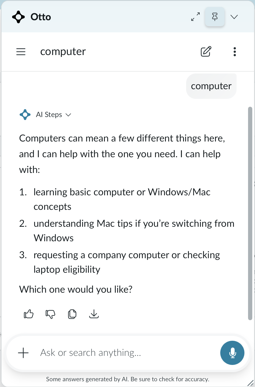
In response to sustained advocacy, the team built a clarification capability. It detected multiple matching sources and presented them as a list.

What it looked like
Otto
I need help with onboarding.

Which option applies?
• New hire onboarding
• New vendor onboarding
• New software tool onboarding

It gave users internal terminology. The distinction I kept drawing was between a system that narrows results and a system that understands what you mean. This was the first. I needed the second.

04 / Removing the Feature Proved Its Worth · Early 2025

Engineering removed the feature without design input. Ten enterprise customers escalated within weeks.

During a platform rearchitecture, the engineering team operated independently and cut disambiguation. They believed it would no longer be needed with more agentic capabilities.

The results immediately proved them wrong. More than ten prominent enterprise customers escalated within weeks, asking for the feature back by name. I finally had the validation I’d been seeking. The company was willing to stand behind me and build it intentionally.

“They liked the disambiguation a lot and it was really working well for them before the change.”Product manager · relaying customer feedback
05 / Research Round 2 · Mid-2025

The research findings got deeper. So did our understanding.

While this was happening, the research game was also leveling up. We moved to comprehensive studies on the conversational AI search experience. The findings went beyond what I’d synthesized earlier. Yes, disambiguation was well received. But it went further than that.

Research found that asking disambiguation questions actually increased user confidence in the system.

This was shocking to some of the more hesitant stakeholders. For months, they’d argued that asking questions was burdensome and would erode confidence. The research landed differently. Users didn’t experience clarifying questions as friction. They experienced them as a signal that the system had actually understood them.

Why this matters

Transparency and trust are inseparable in AI experiences. The extra question didn’t slow users down. It sped them up. Answering one easy question to get a one-sentence answer is multiple times faster than reading four paragraphs to find and extract that one sentence. The cognitive load is lower. The answer is more accurate. The experience is better.

Additionally, internal analysis put a number on how common ambiguity actually was. It wasn’t an edge case. It was the fundamental condition. Users were still operating with a keyword search mental model. Instead of writing detailed prompts that would lead to direct answers, they were asking things like “PTO” or “benefits.”

90%
of queries had ambiguity
47% high · 43% medium

This research proved something fundamental: effective disambiguation design reduces cognitive load, improves response accuracy, and is one of the fundamental differentiators between basic search functionality and a back-and-forth conversation that’s tailored to the user and their specific use case. All of this meant one thing: disambiguation needed to be a core component of the conversation experience.

06 / Disambiguation V1 · Late 2025

It wasn’t perfect, but for the first time, design had a voice in how disambiguation actually worked.

Customer escalations created urgency. The team couldn’t wait for the ideal solution. We needed to ship something fast, and engineering proposed source count as the mechanism.

I had reservations from the start. Source count measures response complexity, not intent ambiguity, and those are not the same thing. “Delete my account” might return a single article but mean two entirely different things: a temporary deactivation or a permanent deletion. Source count would treat that as low complexity and proceed without asking. That’s exactly the wrong call.

But we didn’t have time to debate the mechanism. We needed something live. So I worked within the constraint and focused on making the experience as good as it could be given the technical limitation.

What I delivered for V1

Within those constraints, I defined the experience: how ambiguity should be surfaced, what questions should sound like, and the rules governing the interaction.

The deliverables I produced for v1 were the first documented disambiguation standards at ServiceNow: a design guide defining when to ask and when to proceed, writing standards with explicit before/after rewrites, and a threshold testing framework that stress-tested where source count held and where it broke down.

Source count thresholds

SourcesSignalApproach
1Low complexityProceed. Respond directly.
2–3Moderate complexityApply the decision framework. Proceed with the dominant interpretation if one exists; surface reasoning for grey areas.
4+High complexityNarrow the response. Present the 2–3 most plausible interpretations. Do not list all sources.
Before V1
Otto
Change my plan.

There are several types of plans you may be referring to. If you are looking to change your subscription plan, you can… If you need to change your shift schedule…

V1
Otto
Change my plan.

Which plan would you like to change?
• Subscription plan
• Project plan
• Shift schedule

Shorter. Clearer. Still incomplete.
Recreation · the shipped V1 behavior, rebuilt; live UI not shown

V1 wasn’t the disambiguation I’d been designing toward. But it proved what I needed it to prove: that the collaboration worked, that design’s involvement produced a meaningfully better experience than engineering would have built alone, and that the concept was viable at scale. That proof gave me the buy-in to build it right. That’s what we’re doing now.

07 / The Standard

Design and PM define the target experience from the ground up. Engineering builds toward it.

The next version flips the model. Instead of adapting to what engineering could already build, we start from what users actually need. What follows is the standard I defined for that: the principle, the strategies, and the taxonomy underneath them.

The guiding principle

Resolve ambiguity with the least user effort while preserving response accuracy.

The fundamental insight: the grey area

The core insight is something I named the grey area. Most real queries land here: the system has a sense of what’s meant, but not certainty. This is where honest design happens, where you signal uncertainty instead of hiding it. The grey area is where the four response strategies diverge, and designing those strategies explicitly is what makes the difference between disambiguation that feels helpful and disambiguation that feels like an interrogation.

Strategy 01
Proceed with transparency

When one interpretation is clearly dominant: act on the best guess, name the assumption.

Strategy 02
General answer + clarification

When a useful general answer exists regardless of interpretation: give it. Follow with one clarifying question.

Strategy 03
Ask directly

When interpretations are too distinct and none is dominant: ask directly.

Strategy 04
Prompt for more information

When the query has no discernible goal: prompt for more information first.

The override

When the action is hard to undo, ask before acting regardless of confidence.

The ambiguity taxonomy: Five types

I developed a taxonomy of five distinct ambiguity types from analysis of real query data. Source count cannot differentiate between them. Each type has different signals and calls for a different response strategy.

Ambiguity TypeWhat it looks likeWhat the system doesExample
Multiple valid interpretations Two or more different meanings with no way to rank them. Name what you understood. Present options in plain language. U: I need help with onboarding.
A: Which one? New employee, new vendor, or new software tool?
Domain terminology The user’s everyday word maps to multiple system concepts. Offer brief descriptions so users self-identify. U: Close my case.
A: Which type? Resolved, Cancelled, or Reassign?
Request clear, details missing The intent is obvious but crucial parameters are undefined. Ask for the single parameter that resolves the most. U: Book me a conference room.
A: For how long, and what date?
Ambiguous entity reference The user refers to something without being specific enough. Use context to rank candidates. Ask only if needed. U: Add me to the project.
A: The Marketing Project or the Q3 Refresh?
Contextual ambiguity Something from earlier conversation is unclear. Surface candidates from history. Don’t make them repeat. U: Approve that.
A: The request from this morning or yesterday?

Why this taxonomy matters: a generic approach treats all ambiguity the same. Asking “which one do you mean” for every type produces unnecessary friction. A categorized approach lets you match your response to the specific problem.

Research that backs this: recent academic work on clarification generation finds that ambiguity-type-matched strategies outperform undifferentiated approaches. Removing the matching produces measurable task-completion drops. (MAC: A Multi-Agent Framework for Interactive User Clarification in Multi-turn Conversations, IWSDS 2026)

The writing level: Matching tone to risk

The guidance I developed goes further than V1. V1 said what to avoid. The standard defines the underlying principle: lead with what you understood, not what you don’t know.

One question per turn. Mirror the user’s language. Always give users a way out so they’re never stranded by options that don’t fit. If two rounds don’t resolve it, make a best attempt and state remaining assumptions explicitly.

V1 (source-count driven)
Otto
Reset my account.

Which type of reset?
• Password Reset (Tier 1)
• Account Deactivation Temporary
• Account Deactivation Permanent
• MFA Device Removal
• Access Privilege Rollback

Type-matched
Otto
Reset my account.

Just to make sure I get this right: did you need to reset your password, or do a full account reset? A full reset can’t be undone.

The connection to transparency and trust

Most organizations design for transparency (showing everything) when they should design for trust (showing what matters). Those are different problems with different solutions.

In disambiguation, the trust problem isn’t solved by exhaustive option lists. It’s solved by showing that the system understood the core of what the user asked and is asking for help with just the ambiguous part. Users trust AI more when it’s honest about uncertainty, not when it hides uncertainty behind comprehensive responses.

This is why the taxonomy matters at the model level. If the model can categorize the ambiguity correctly, it can respond in a way that builds trust: “I understand what you’re trying to do. Here’s the one thing I need clarity on.” Building that judgment into how the model reasons, rather than patching it into the output afterward, is what designing at the reasoning layer actually means.

See also

Agentic AI Processing Transparency: How I redesigned how AI systems communicate while they’re reasoning, grounded in the principle that designing for trust and designing for transparency are not the same thing.

08 / Impact

Shipped, customer-validated, and built into how the platform reasons

The proof came from users, not a framework. Disambiguation shipped and became something customers depend on: when it was briefly removed, more than ten enterprise customers demanded it back by name, and fifteen internal teams asked to adopt the pattern. That is not interest in a feature. It is recognition that design had solved a structural problem the whole organization was struggling with.

That pull is what earned design a permanent seat. Design is now a named partner in how the platform reasons about ambiguity, from the architecture conversation forward, not the UX review at the end. I made it stick three ways: I produced artifacts, not recommendations, the taxonomy, writing standards, and evaluation criteria engineers could implement immediately; I sat in architecture reviews as a thinking partner rather than handing over a solution; and I stayed through implementation to explain the reasoning behind every decision.

“She pushed and got this back on the docket and formatted it into the output the customers have been asking for.”Content design colleague · ServiceNow

The organizational models now point in the same direction. Internal reporting projects deflection improving from roughly 8% to 36% as conversational pattern coverage expands from 40% to 83% of intents. Those are projections from the business model, not outcomes I claim credit for. But the pattern coverage they depend on is the work this case study describes.

Projected · internal business model

8%
Today
4.5× projected lift
36%
At 83% intent coverage
Deflection as conversational pattern coverage expands from 40% to 83% of intents. These are projections from the business model, not claimed outcomes, but the pattern coverage they depend on is the work described here.
09 / What I Learned

It can be hard to be ahead of the curve. And it’s fulfilling when you see your influence.

The biggest thing I learned: ambiguity isn’t an edge case to handle, it’s the default condition. Ninety percent of what users send needs interpretation, which makes the decision of when to ask versus when to act the core of the design, not a fallback for when things go wrong.

I learned to treat uncertainty as a surface to design, not a failure to hide. A system that signals what it’s unsure about and asks one focused question reads as more competent than one that guesses confidently. Getting that right lives at the model and reasoning layer, not in the copy on top of it.

And I learned how hard, and how rewarding, it is to be early. Organizational readiness is a constraint on timing, not a verdict on the thinking. Holding conviction through the slow parts is what turned a research hunch in 2023 into a shipped standard that customers defended by name.

Research Sources

Internal Research

External Research