Agentic AI · Processing Transparency · ServiceNow Otto · 2023–Present
Making AI’s Work Legible
Designing how an agent communicates while it thinks, decides, and acts
In a conversation between two people, a pause usually means someone is thinking. Agentic AI changed the meaning of that pause: Otto was no longer just retrieving an answer, it could search systems, consult policies, make decisions, create records, route work, and act on someone’s behalf. I led the design of how that work becomes legible across model design, content design, and product design.
What this produced
0customer escalations asking to disable processing updates after the redesign shipped. Companies had been turning the feature off entirely before.
A Spec That TraveledThe processing-state specification outlived the project it was written for, and is still the reference for how Otto describes its own work.
The model had to describe what it was doing. The language had to translate that behavior into human terms. The interface had to make the work visible enough to trust, without turning system machinery into the main experience.
I challenged the assumption that the problem was latency, partnered with research to understand what users actually needed during the wait, turned those findings into model-behavior rules, and owned the product direction for AI Steps, a shipped pattern that made agentic work visible without forcing users to inspect it. After launch, customer escalations asking to disable processing updates dropped to zero.
Role
Staff Designer, Conversation Design Lead · Strategy, Model Behavior, Content Systems, Product Direction, Research Direction
Timeline
2023 – Present
Impact
Disablement escalations dropped to zero · shipped across Otto
The shipped pattern: AI Steps, describing the work in task language. What it replaced comes later. It is the argument of section 02, not the opening image.
01 / Agentic AI Turned Loading Into a Trust Problem
Everything between “I understand” and “here’s what I did”
Processing transparency is everything the AI communicates between “I understand what you want” and “here’s what I did.” For a simple chatbot, that space might only need a spinner. For an agent, it can contain understanding, retrieval, policy checks, comparisons, decisions, actions, and verification.
01Understand
02Investigate
03Decide
04Act
The system may perform dozens of backend operations inside that middle space. The design problem is deciding what a person needs to know in order to understand what is happening and judge whether the AI is doing the right thing.
As Otto became more capable, the loading experience evolved in stages.
Stage 01 · 2023
Three-dot loader
Something is happening.
Stage 02 · 2024
Skeleton loader
Something more substantial is happening.
Stage 03 · 2025
Technical processing labels
The system can show execution, but only from its own point of view.
Executing agent XRS-142
Writing to HRSD table
Running routing policy evaluator
Executing agent XRS-142
Writing to HRSD table
Running routing policy evaluator
Stage 04 · 2026
AI Steps
The system describes work in terms users can understand.
Understood requestFound contextDeciding
The turning point was that agentic AI changed what the wait meant. Users were no longer simply waiting for an answer. They were waiting while the AI acted on their behalf.
The AI had become more capable. The way we communicated its work had not become more understandable.
Earlier loading patterns
The first loaders worked because the system’s job was limited. A spinner or skeleton state communicated enough when Otto was retrieving or generating a response within a few seconds.
But once Otto began interpreting records, consulting policies, making decisions, routing work, and creating or changing data, generic loading states stopped communicating what users needed to know.
The technical-label phase tried to solve that by exposing execution, but it exposed the wrong layer. It made system activity visible without making the work understandable.
02 / The Transparency We Had Was Making Things Worse
More information, less understanding
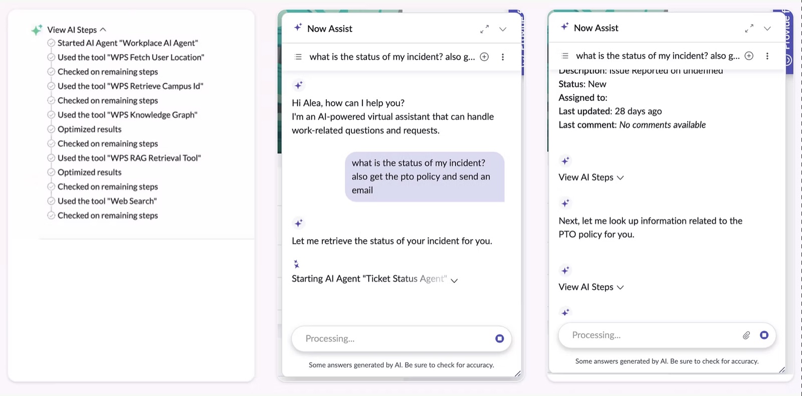
The technical processing state looked transparent internally. Every agent, workflow, tool, and system operation could produce a visible step. Users might see:
Executing AI Agent ‘fetching_user_details’
Payload ID rId-00432 processed by CAB agent
Rationalizing
Initializing case handler / Writing to HRSD table
Architecture exposedNo user goalNo hierarchyHigh cognitive load
What actually shipped before the redesign: real tool and agent names, straight from the backend, with no translation layer between them and the user.
Actual product · before the redesign
From an engineering perspective, the system was showing its work. From a user perspective, the work was mostly meaningless. Usability research found that people struggled with terms like “Payload ID,” “Used tool,” and “Rationalizing.” Customers escalated the experience. Some asked for the information to be reduced. Others asked for processing updates to be removed or turned off entirely.
The contradiction
We added processing detail to increase transparency. Users responded by asking us to hide it. That told me the real question was not “how much of the system can we expose?” It was “what information actually helps someone trust the work?”
Why technical transparency failed
The issue was not that the information was inaccurate. It was accurate from the system’s perspective and unhelpful from the user’s perspective.
The execution chain mirrored backend architecture: agents, tools, APIs, payloads, databases, and routing logic. But users were not trying to decode the architecture while they waited. They were trying to understand whether Otto had understood them, whether useful progress was happening, and whether the final result would be trustworthy.
That distinction became foundational: transparency and trust are related, but they are not the same design problem.
03 / I Reframed the Problem From Latency to Value of Automation
The problem wasn’t the wait. It was uncertainty during it
The organization was focused on latency. As AI tasks grew more sophisticated, responses naturally took longer, and the concern was that users would abandon a slower experience. I thought we were measuring the wrong thing. If an AI takes ninety seconds to complete something that would otherwise take a person an hour, is ninety seconds actually slow?
I partnered with UX Research on studies exploring latency and output quality, and pushed the framing from wait-time tolerance to perceived value of automation.
Time to response
How long before the AI answers.
≠
Time to outcome
How long before the task is actually complete.
The research showed that users tolerated longer waits when the result was meaningfully better, the task seemed complex enough to justify the time, and the system communicated what it was doing.
“
It took a while, but if I knew this is the amount of information it would give me, it’s totally fine.
Participant · latency and output-quality study
The problem wasn’t simply the wait. It was uncertainty about whether anything valuable was happening during it.
That shifted my design lens. I mapped the waiting experience around user trust rather than system execution.
What the user is asking themselves, and when
Did it understand me?
Is it making progress?
Does the work make sense?
Why did it make that choice?
Can I trust the result?
Am I still in control?
Six questions, asked in order, all of them about trust rather than time
Users were not trying to inspect the system. They were trying to decide whether to trust the outcome.
See the research behind the reframe
The study originally asked how long users would wait before the experience became unacceptable. I reframed the work around a sharper question: when does waiting feel worthwhile because the AI is reducing effort?
The strongest patterns were:
Better outcomes justified more time
Participants preferred higher-quality, more complete results even when they took longer.
Expected effort shaped expected latency
Users understood that complex work should take more time than simple work.
Communication changed the wait
People were more comfortable when they understood what the AI was doing and why the work was taking time.
This made processing transparency part of the value proposition of automation, not just a loading-state problem.
04 / I Used Research to Find the Right Abstraction
Task, not technology
To find out what users actually understood, I partnered with UX Research on a card sort using real examples of Otto processing steps. We asked three things: What can users understand? What do users actually want to see? Which backend operations feel like one piece of work?
The card sort revealed that users did not create a simplified version of our architecture. They created a different representation entirely. They grouped work around what the AI was accomplishing, not which component was executing.
The useful level sat between technical and generic.
Too technicalExecuting ‘relationship_rules_engine’
Right level“Checking related incidents.”
Too generic“Working on your request.”
This was the key model-design insight: we were not just simplifying labels. We were deciding which level of system behavior should become visible to a human.
See the card-sort methodology
The card sort focused on processing steps Otto was already exposing. We wanted to know which labels made sense without architectural knowledge, which pieces of information helped users judge progress, and which steps users naturally grouped together.
The important finding was not simply “users dislike jargon.” It was that their mental model of the work was organized differently from the system’s execution model.
Scattered system cards
Executing AI Agent ‘fetching_user_details’Executing agent XRS-142Initializing case handlerWriting to HRSD tableRunning routing policy evaluator
The system model: organized by which component ran.
User-generated clusters
Understand the problemFind relevant contextFigure out what to doTake action
The user model: organized by what the AI was accomplishing.
That research gave us the evidence to stop organizing processing around execution and start organizing it around intent.
05 / The Content System
Teaching the system to describe itself
To ensure that every step shown to users carried the right level of detail, communicated in a human-legible way, I authored the processing-state specification. The document defined research-backed behavior rules that engineers could implement through prompting and generation logic. It also carried eval criteria, so they could check the success of the end result.
What was in it:
Behavioral rules for generated stepsInternal event to user message translation patternsProduct vocabulary standardsExamples and counterexamplesEvaluation criteria
Inside the processing-state specification
Internal event
Generated message
execute_agent(fetch_user_details)
→
“Finding your contact information.”
The behavioral rules were research-backed.
Rule 01
Task, not technology
Name what is being accomplished, not the mechanism.
Rule 02
Active and present tense
The user is watching work happen, not reading a log of it.
Rule 03
Specific when it earns it
Detail is how you show real context was found.
Rule 04
No internal terminology
Agent IDs, API paths, model names and tables never leak.
Rule 05
Product vocabulary
Say incident, request, change. The words users already have.
Rule 06
Glanceable
Processing is read in peripheral attention, or not at all.
I wasn’t writing processing strings. I was designing the translation layer between machine execution and human understanding.
What the system actually says now
The spec’s output is not a set of strings I wrote. It is the shape every generated step has to take. Run those rules over one HR request, the same request whose raw execution chain opens section 02. This is what has to come out the other side:
Understanding your requestChecking your 2 open incidentsReviewing the equipment replacement policyCreating your HR caseFinding the right team
Every line is a task rather than a component, in the present tense, specific where specificity proves real context was found, with no agent, tool or table names, in the vocabulary the product already uses, incident, policy, case, and short enough to read out of the corner of an eye.
06 / The Visual System
The pattern for showing work as it happens
The interface then had to decide where that generated information lived, how much attention it demanded, and how it changed over time. I owned the product direction: what information belonged, how prominent it should be, when it should be collapsed or expanded, and how the pattern should scale. I worked with visual design on color, line treatment, hierarchy, shimmer, and visual patterns, and with motion design on where movement clarified active work versus where it became noise.
Two questions were tangled together in those explorations, and they came apart once I stopped treating them as one: how the work should be shown, and where on the message it should sit. They have different answers, and either can be got right while the other is wrong.
Decision 01 · How to show it
Understanding your request
Checking your open incidents
Reviewing the policy
Creating your HR case
Option 01
Status line that cycles through the steps
WorksOne line, always current. It moves, so it never reads as a system that has stalled.
CostsEvery step it already did is gone. You can see the moment, never check the work.
Thinking
Understood your requestChecked your open incidentsReviewing the policy
Option 02
Thinking spinner that expands on demand
WorksNearly silent by default, with the whole trace one click away for anyone who wants it.
CostsClosed, it says no more than a spinner, and nothing signals that opening it is worth the click.
Understanding your request
Checking your open incidents
Reviewing the policy
Creating your HR case
Option 03
Spinner and a changing status line
WorksCombines 01 and 02: liveness and the current step at a glance, the full list still on demand.
CostsTwo moving things in one row. The motion has to stay very quiet or it competes with the answer.
Checking related incidents
4 of 7 steps
Option 04
Progress card
WorksA count and a bar answer “how much is left?” directly, which no other option does.
CostsA bar promises an estimate. The system could not reliably produce one.
Understood your requestChecked your open incidentsReviewed the policyCreating your HR case
Option 05
Expanded workflow card
WorksThe right amount of evidence when the AI is doing something consequential.
CostsFar too heavy as a default. A one-line answer arrives buried under its own receipts.
None of these is wrong. They are answers to different questions about how much of the work a person should be asked to hold.
Decision 02 · Where to put it
AI Steps · Reviewing the policy
Placement A
Above the message
WorksSeen first, and it holds still while the answer streams in underneath it.
CostsPuts the waiting above the result, so waiting becomes the main event.
AI Steps · Reviewing the policy
Placement B
Below the message
WorksSits with the newest content, which is exactly where someone following a growing answer is looking.
CostsOnce the answer runs long, the record of the work is somewhere off the bottom of the screen.
AI Steps · Reviewing the policy
Still working
Placement C
Split, part at the top and part at the bottom
WorksSplits the two jobs. The named step stays where it can be found; liveness follows the bottom, where the reading is.
CostsTwo places to look instead of one, and both have to stay quiet enough to ignore.
The placement question is not cosmetic. It decides whether the record of the work or the liveness of the work gets the position a reader’s eye is already in.
Pick one directionAnswer both: option 03, split across the message
What we shipped
Option 03 × Placement C
AI Steps, collapsed by default Shipped
WorksThe shimmer names the current step at the top and opens to the full list; the spinner carries liveness at the bottom. Neither job is asked to do the other one.
CostsTwo places to look, and one more thing to open. That was the trade we chose to make.
Recreation · UI rebuilt in CSS; the steps are verbatim from the shipped product
Meaningful activity surfaces at the top; liveness stays visible at the bottom, wherever the user is reading.
Glance
See the latest active AI Step.
Monitor
Know work is still happening as the response continues.
Inspect
Open AI Steps when deeper detail is needed.
Make the AI’s work visible enough to build trust, but quiet enough that the result stays primary.
Implementation examples and earlier visual explorations
Implementation examples
Before
After
Executing AI Agent ‘fetching_user_details’
→
Finding your contact information
Executing agent XRS-142
→
Checking your open incidents
Initializing case handler / Writing HRSD table
→
Creating your HR case
Running routing policy evaluator
→
Finding the right team
Product rules from the explorations
Keep the answer primary. Processing should support the response, not compete with it.
Keep AI Steps available but collapsed. Users should be able to inspect work without being forced into inspection.
Show the latest meaningful step. The shimmer should surface what the AI is actively doing now, not every backend event.
Use motion to clarify liveness. Motion should communicate active work or state change, not decorate the wait.
Avoid false precision. Use estimates, percentages, or progress bars only when the system can support them reliably.
07 / What Shipped, and What Changed
Visible without becoming the main event
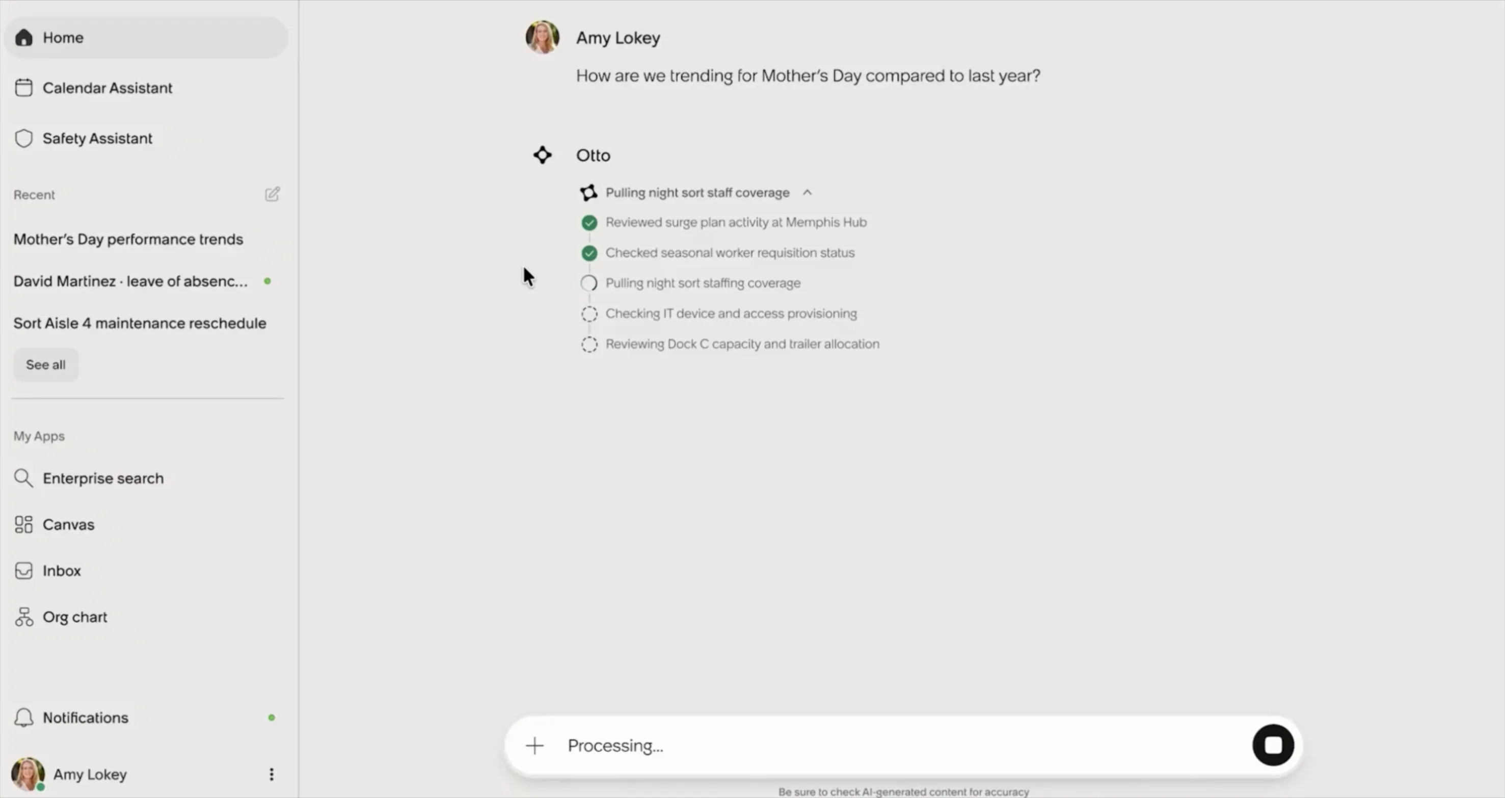
AI Steps in the shipped product. The panel stays collapsed until there is something worth showing, then reports the work in task language as it happens.
Actual product · screen recording, Otto
Product
AI work became visible without becoming the interaction. Glance, monitor, or inspect. The user picks.
Model behavior
The model got rules for translating execution into human-legible work, instead of leaking implementation detail.
System
The processing-state spec outlived the project and became the reference other work builds on.
What I think of what shipped
The content framework was a major improvement. The UI got cleaner, and it is still far from perfect. A lot was sacrificed on the UI to ship it. It needs to be more consolidated, it needs better estimates for how long a process will take and how complex it is, and it needs to make status easier to check both while the AI is working and after it finishes. Those three gaps are exactly what converged in the next design.
08 / What Comes Next: Workflow and Sources Concept · not shipped
What a user needs isn’t the reasoning. It’s the evidence
Agents are getting more autonomous, making judgment calls, writing to records, committing someone to an escalation. A list of completed steps stops being enough to act on. So in the future-state work that followed (internally, the AI Blueprint) I stopped asking “how much reasoning should the AI expose?” and started asking “what evidence does the user need in order to trust and act on the result?” That question sorts agentic work into four kinds of information.
Progress
What is the AI working on? Purpose: orientation.
Evidence
What information is it using? Purpose: verification.
Judgment
Where did it make a meaningful choice? Purpose: explanation.
Action
What did it actually do? Purpose: agency.
These should not all be represented the same way. A routine lookup does not deserve the same prominence as an AI deciding to escalate a critical incident.
What it would look like in product
Workflow and Sources is one place holding everything needed to trust a response, organized by the user’s intent rather than the system’s architecture. A full-width progress card while the work runs, openable mid-run to follow along, that collapses to a small button beside the finished answer, with every step and source still inside it and filterable to sources only.
Try it. Click the progress card to follow along live, then open Workflow and sources.
Otto
My laptop won’t connect to the VPN
Your Cisco VPN client is holding a stale auth token after your Mac woke from sleep. That’s why it won’t connect. Restarting the client clears it, so I’ve prompted the restart for you. You should be back online in a moment.
VPN connection troubleshooting
Understood the connectivity issue
Checked your device and network
Checked server status. All pools online, no regional outages, certificates valid
Verified your permissions
Checked your VPN entitlement and current group membership
Consulted the VPN ACL database
Found the likely cause
Analyzed your connection logs: client crashes after wake, auth tokens stale
whyYour last two connection failures resolved with a client restart. Same pattern here
Reviewed your device event stream against the known issue database
Personalized the solution
Your device: macOSCisco VPN client v9.1.2corporate WiFi
whyFiltering to only macOS + Cisco + corporate steps, skipping 40+ unrelated remediation paths
Every source, policy and claim is meant to be clickable and verifiable, and the layer is meant to scale from a one-line lookup to a multi-intent workflow without fragmenting.
The principle underneath it
Good transparency is not maximum visibility. It is calibrated visibility. For simple work, the best processing experience may be nearly invisible; for complex or consequential work, more of that evidence should become available.
09 / Closing
What this changed about how I design AI.
None of the larger ideas in this work arrived fully formed. I started with a product concern about waiting. I challenged the assumption that latency was the problem. That led to research showing that users cared about the value and legibility of the work. That made the existing processing experience look different: we were giving users technical transparency when what they needed was evidence of meaningful progress.
Rather than assume what should replace it, I partnered with research to card-sort the actual processing steps. Users showed us that their mental model was organized around goals rather than infrastructure, which gave me task, not technology. I translated that insight into a research-backed content model. Scale then forced me to turn the content model into model behavior. Shipping that behavior exposed another problem, understandable information can still overwhelm when there is too much of it, which led to the collapsed-by-default AI Steps pattern: visible enough to build trust, quiet enough to keep the result primary. The limits of that shipped pattern then pointed at the next question: not how much of the work to show, but what evidence a user needs in order to act on it.
Each idea came from finding the point where the previous solution stopped working. AI design is not just the design of an answer. It is the design of the relationship between what the system is doing, what the user can understand about it, and how much control they need at each moment. That relationship spans model behavior, content, interaction, and product architecture, and as AI becomes more autonomous, designing it well becomes increasingly important.